
Overview
One motif, carried through the whole site.
Once the mark was rebuilt from equal triangles, the diamond at its center stopped being just a logo detail and became the redesign's throughline. It shows up as a hover state on the investment carousel, a section divider in the brand guidelines, and a loading cue tied to "One prism, multiple perspectives." The same geometric logic scaling down into UI and up into full-bleed photography without ever feeling bolted on.
Detail
A pattern built to reuse.
This case-study carousel is one of the scalable components built for the new design system, a pattern that could hold any number of investments, in any order, without needing a bespoke layout every time.

Process
From an uneven mark to a full system.
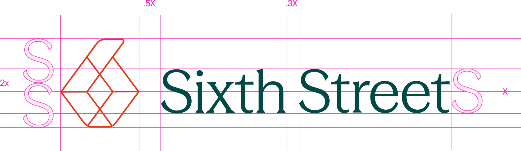
The existing logo had real balance problems. The geometry didn't sit right at any size. I rebuilt it from scratch: a six made entirely of equal triangles, with a diamond at the center where they meet. That same triangle logic of sharp angles and softened edges carried through the rest of the identity, and the diamond became a recurring component across the site. I supported the brand guidelines alongside the broader design system update, documenting how the new mark and its motifs should scale across every touchpoint, down to a single motion cue built around "One prism, multiple perspectives."


Color System
A palette rooted in place.
Drawing from San Francisco's distinctive landscape, where Sixth Street was founded, we built a comprehensive color system rooted in place. Every hue references this source: the International Orange of the Golden Gate Bridge, the deep Pine of Marin at dusk, the saturated Ocean of the bay itself.


